
Unless you have 1000s of devices to hand, using a web browser’s built-in developer tools is the best method. Let’s take Chrome as an example.
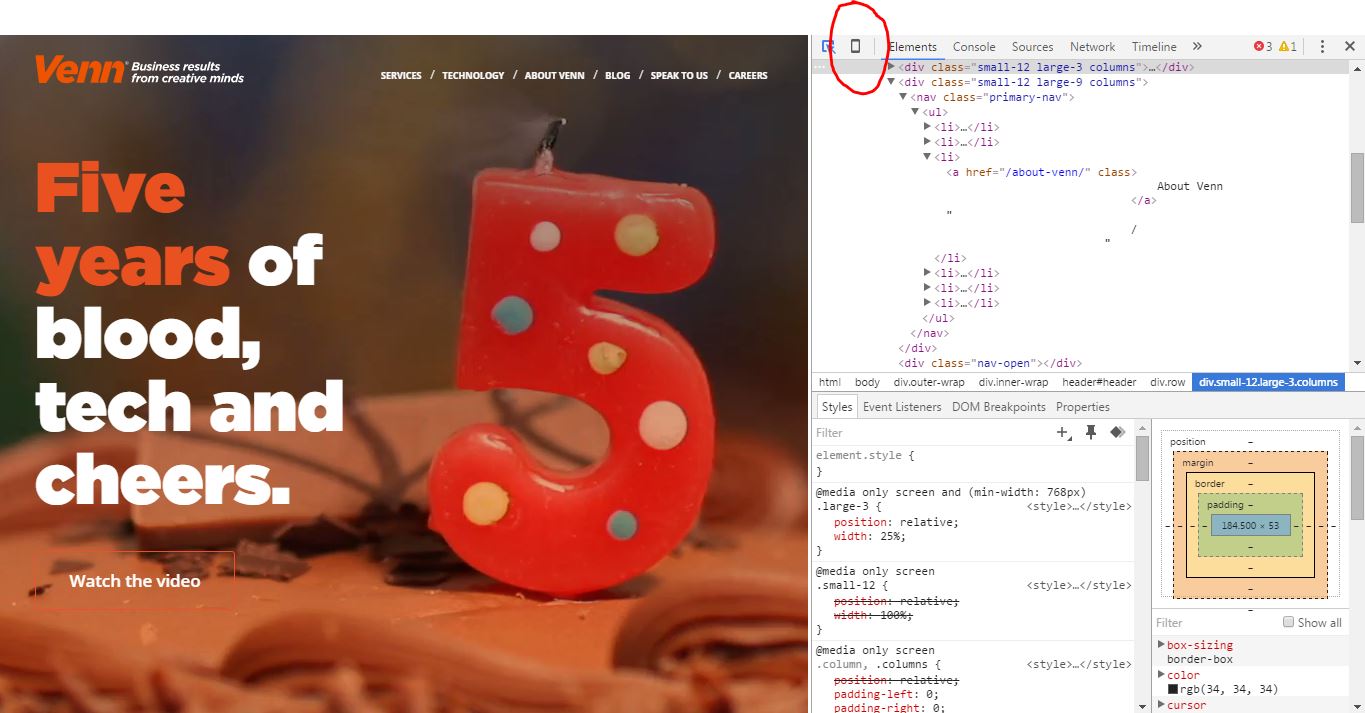
Right click on your webpage and choose ‘Inspect’.

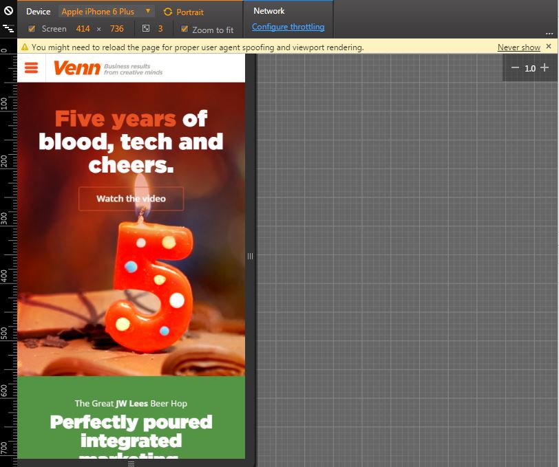
You’ll get a window that shows lots of code. Don’t worry, just click the ‘Device Mode’ button (the one shaped like a phone).
This gives you a device select drop-down menu and manual options for you to see how your site responds to different screen sizes. Play around!
If your site doesn’t work on any popular sizes, you should really do something about it.